KG Designs Portfolio
The Business Club
Brand Identity
Brief:
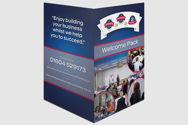
The Business Club Northants wanted to expand and offer a third networking group for small new businesses. This project needed a new logo, presentation folder, and business card design.
The Concept:
Using the current logo styles for the two clubs, KG designed a new logo that would keep with current brand colours and typography.
The presentation folder was designed to suit a one job does it all approach when giving away these free welcome packs to new members.
With now 3 clubs the client needed business cards to match. KG designed a business card that would keep the same style but an adjustment on each logo so the overall brand gives the same consistent style.
Result:
• Logo Design
• Designed & Printed A4 Presentation Folders
• Designed & Printed Business Cards
IMC Pro Solutions
Brand Identity
Brief:
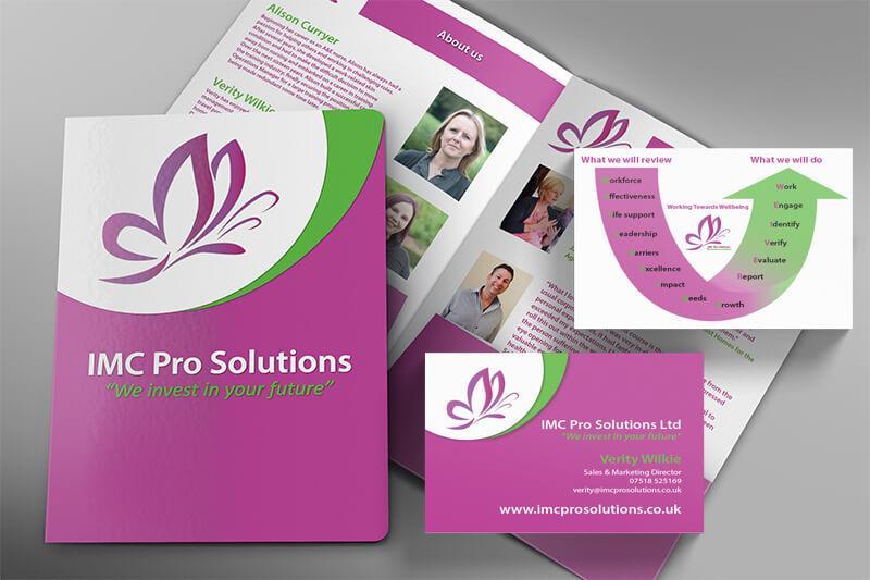
IMC Pro Solutions needed a presentation folder to give away to new clients at meetings, networking events and exhibitions. The folder would be designed to give information about each team member and the services they offer when “investing in a clients future”. They also required business cards designing to match their folder and use an infographic that has been designed to show their wellbeing review process.
The Concept:
The logo needed to be retouched to make the folder look sharp when printing. The logo was taken from a PNG and turned into a vectorised artwork. KG then designed the folder with information on each team member and also some testimonials. The colour of the folder matched the pink branding they currently liked which has now given them an established local nickname of the “pink ladies” due to the prominent and recurring colour scheme.
The business card design needed to match the current folder design style, Taking this into consideration KG put together the card design using the same typography and colour scheme.
Result:
• Logo Re-touch
• Presentation Folder Design & Print
• Business Card Design & Print
Weekend Wheels
Business Card & Voucher
Brief:
Weekend Wheels approached KG from a referral about having some new business cards designed. They currently used an online service to design and print their cards but felt it did not match with their new branded vehicles that they had purchased.
The Concept:
After meeting with the client and discussing what content they wanted on the card, KG decided to take the current red and yellow lines around their vehicles onto the design of their business cards. Using such strong analogous colours this meant the background on the cards could be white to make the design on the card simple but stand out.
KG then created a gift voucher using the same colour and typography from the cards to sell to people who wanted to give driving lessons as a present. The newly designed vouchers sold like hot cakes, and the overall brand identity has given the client the opportunity to franchise the business.
Result:
• Designed & Printed Business Cards
• Designed & Printed Gift Vouchers
• Increase In Voucher Sales and Referrals
Leaseline (Bedford)
Banner & Flyer
Brief:
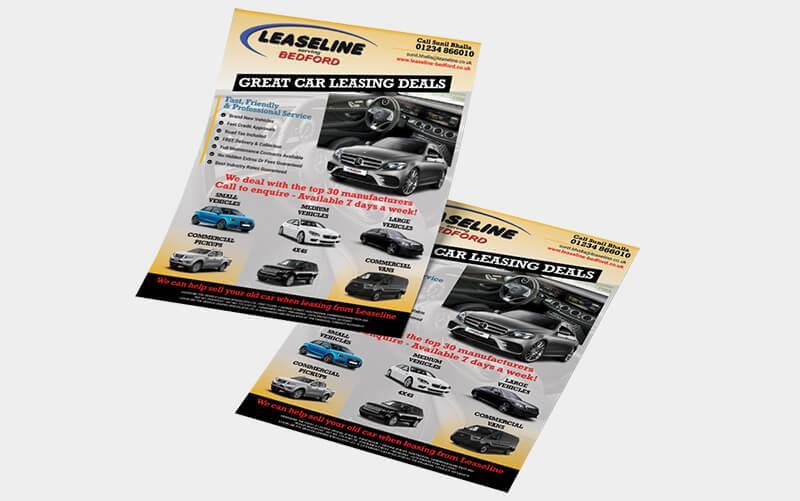
Leaseline wanted to create some new marketing materials to promote the types of vehicles they can lease. The issue was that they currently had a plain white flyer with just some key points and a photo.
The Concept:
After researching the types of vehicles they offer and also the current brand colours and fonts they use, I got to work. Firstly designing their new flyer which can be delivered through domestic letter boxes and business addresses. The design needed to look professional but also portray the right information. This is why I structured the design to have the vehicles at the bottom and the important information at the top left.
The client was extremely happy with the flyer and decided they wanted it re-designing into a PVC banner that they could use at exhibitions and networking events.
This project gave Leaseline a flyer and banner that matched with current branding but also worked very effectively at selling the new range of 18 plate vehicles to businesses this year.
Result:
• Designed & Printed A5 Flyer
• Designed & Printed 800X2000mm PVC Banner
Logo Design
Over the years I have been tasked with designing logos for small to medium sized businesses in a variety of industry sectors.
I believe a logo design is the most pivotal point of a companies brand. A well thought through logo design should be timeless and instantly recognisable to customers and competitors in their market.
These are some example logos I have designed and developed for clients that range from networking clubs, power product supply, service improvement specialists, and even a clothing brand.
I have many more examples of logos that I have created and developed, from tradesman to entertainment companies, each logo is unique and developed for each individual client, as this is paramount as no business is the same and neither should their logo.


InfoGraphics
Infographics are a great way to increase brand awareness & reach, by promoting products, services or even something totally unique like explaining a process.
If designed correctly they can be visually appealing using a brands consistent colours, shapes, logo and effective content.
I have designed numerous infographics for a range of clients. The two here are examples of infographics that explain processes of how each business works. The first is a design used to explain a review that IMC Pro solutions offers to businesses looking to review the wellbeing of employees mental health. When in a meeting they use the design as a visual aid to show where they are during the process.
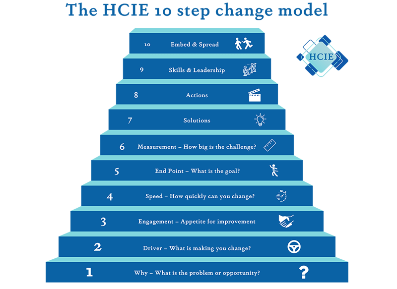
The second infographic design, is a 10 step model used by HCIE who I have previously created a logo design for.
The 10 step model is a visual aid to show how they plan to implement changes into potential businesses that have issues on cashflow, systems processes, and increase in time management. More so particularly in the national health system. HCIE has successfully used this infographic to win multiple tenders to review crucial systems within the NHS.


